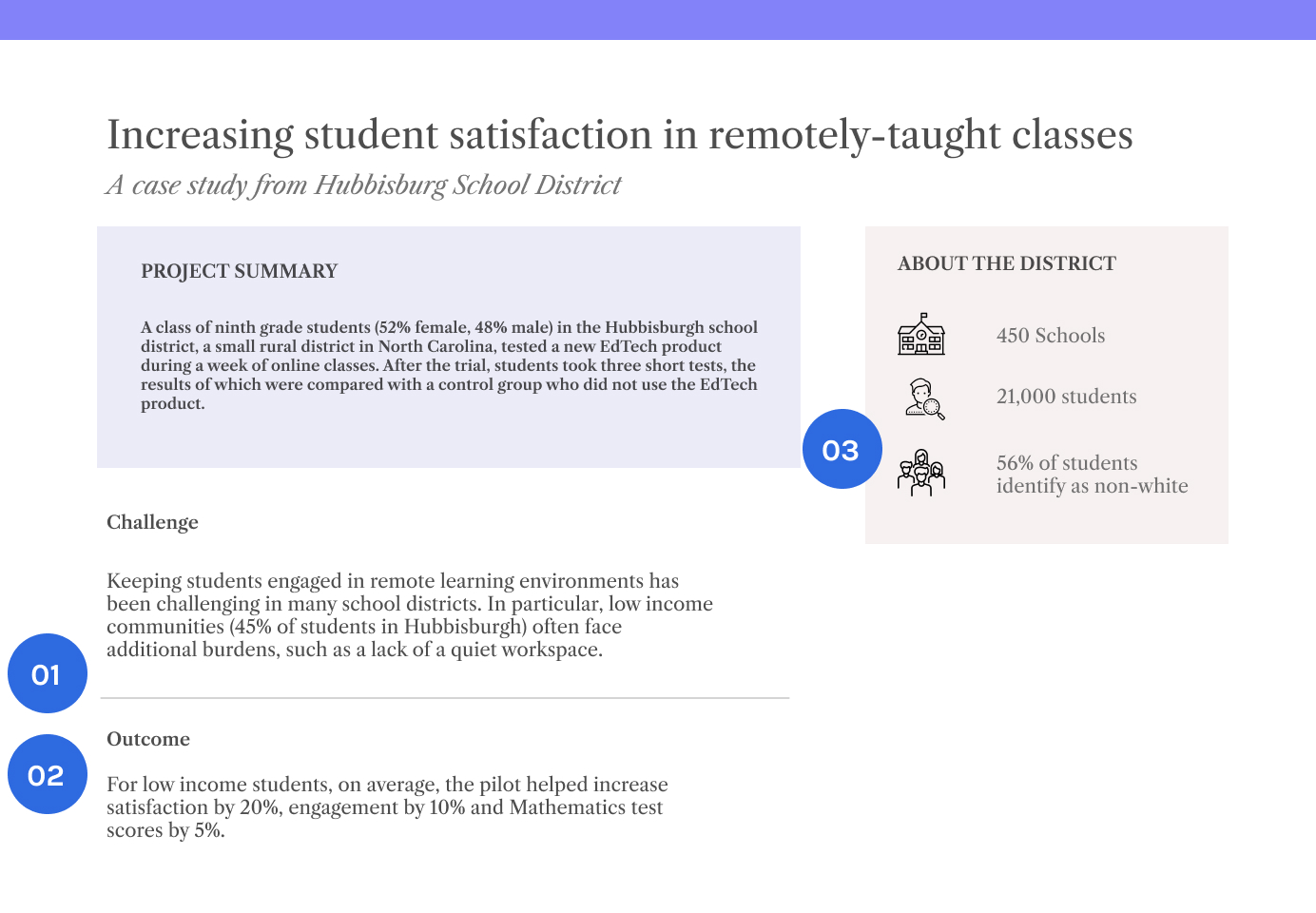
Home Tools Simplify your communication

Introduction

Simplifying your communication is about making your messages clear, direct, and easy to understand. This is a tool that aims to provide guidelines in making your communications simple and accessible. Evidence seekers are often time-pressed; so wordy, jargon-heavy, and poorly formatted texts can dissuade them from engaging with your evidence. 

We’ve structured it into six dynamic chapters, each with a unique focus, designed to empower you with the skills and insights necessary to engage and inspire evidence seekers. From crafting captivating evidence titles to effectively communicating statistical results, this toolkit is your guide to becoming a persuasive communicator of data-driven insights.

At a glance

  • Captivate with Your Evidence Titles            
    Develop the skills to create concise, attention-grabbing titles for your evidence.
  • Visualize Insights for Impact                
    Explore various data visualization methods to enhance the clarity and impact of your information.
  • Spotlight on Key Takeaways                    
    Master the art of presenting key takeaways in a compelling manner.
  • Inspire Action with Case Studies            
    Acquire the ability to create case studies that motivate district leaders to use evidence in their decision-making.
  • Contextualize Data for Persuasion            
    Learn how to frame information and data effectively to engage and persuade evidence users.
  • Speak Data with Confidence                
    Develop the skills to communicate complex statistical concepts in a way that resonates with your audience.

Download a Postcard Summary
to Unlock Key Insights

A Framework for Simplified Communication

Even though evidence creators are cognizant of the utility in making communications simple, clear, and intentional, it is often underutilized. We can utilize frameworks to more easily craft effective messaging.

The EAST Behavioral Framework is designed to make communications to stakeholders Easy, Attractive, Social and Timely. Developed by the Behavioral Insights Team (BIT) in 2012, the EAST framework provides a simple outline for different stakeholders to optimize their work using behavioral science.2 While EAST was initially designed to improve public policy outcomes, it has since been applied in other industries as well.

Following this framework, evidence creators such as yourself can craft messages that communicate evidence in a more accessible manner.

Framework

new

Easy

Messages should be clear and simple; topics that are too complex or detail-oriented are likely to be ignored

magnet

Attractive

Communications should be visually appealing

group

Social

Messaging should emphasize how others are using a policy or product and create an explicit commitment to others

time

Timely

Communications should be sent when people are most receptive to them, typically during periods of significant change

Understanding Your Users: An Important Precursor

Lastly, before you begin, it is important to note that TDL’s research with evidence users 3 revealed common mistakes that make it difficult for audiences to understand evidence:

  • Titles that fail to communicate key takeaways upfront
  • Complex explanations of study methods and design
  • Findings are described only in highly technical terms
  • Key takeaways are buried in lengthy reports
  • Key details about the sample are concealed, preventing readers from applying findings to their own contexts

By addressing these gaps (and more), your readers can easily and quickly understand the important points. Furthermore, you can help keep them engaged for longer when they understand the value proposition of your evidence and how they can benefit from exploring further. A way to begin addressing gaps is to first identify who you intend to speak to in order to understand how to craft clear and impactful messages.

Tools to help you identify your audience needs
Refer to this tools to understand and determine the what and how of your message

Captivate with Your Evidence Titles

Complex or vague evidence titles can discourage audience engagement. By contrast, clear and informative titles that convey research context, scope, and results boost the likelihood of deeper exploration.3

This section of the toolkit offers guidance and a collection of best practices to help you revamp your evidence titles for optimal engagement.

The Struggle with Long Evidence Titles

Readers often skim through numerous sources to find relevant content, and the title serves as the first indicator of a resource’s usefulness. This initial impression plays a crucial role in how the content is received.

Clear, concise, and memorable titles can make your resource stand out. Our research has shown that:

  • Shorter titles tend to be more easily understood and, as a result, receive more citations. 4
  • Over the past two decades, online searches have become the primary method for finding literature, and there’s a positive correlation between title length and citation count. This relationship aligns with Search Engine Optimization (SEO) principles.5

Mistakes to avoid

Group

Using a general title that describes a broad topic

Instead, start with a working title that is specific to the evidence you are presenting.

Group

Writing a title that could appeal to a broad audiencev

Instead, tailor your title to your expected audience.

Group

Writing a longer descriptive title

Instead, keep it concise.

Example

Ineffective Title

  • 01 Research method may not be a necessary addition.
  • 02 Case of the study becomes less salient due to positioning in the title.
  • 03 Context could be specified in the body (or implied through the publisher) .

While many portals, from journal publishers to blog sites, allow for titles upwards of 400 characters, long titles might take away from the key focus of the evidence, leading to lost interest or relevance to readers.

Effective Title

  • 01 Eye-catching lead
  • 02 Direction of the study
  • 03 Tool or method of focus

Aside from from reducing the characters in a title, emphasize key words that will make the resource more relevant to evidence seekers.

Visualize Insights for Impact

Data includes different types of information collected, analyzed, and used for decision-making. This information can be in the form of numbers, text, audio, images, or video and is often stored electronically.

Data visualizations, in particular, are graphical representations of selected data points. They provide an easy way to identify trends, anomalies, and patterns. This section provides illustrative examples to help evidence creators and curators understand how visualizations can improve the understanding and use of data.


Selecting Data Visualization Strategies

In evidence, tables are traditionally used to present data, such as sampling distributions and regression results. However, district purchasers consider raw data in tables the least useful in decision-making; only 2% of decision-makers prefer using tables over visualizations.3

In order for the reader to quickly grasp your message, consider translating raw values into accessible visual representations. Use the tool below to guide you in finding the most appropriate visual representation for a given type of evidence.

What is your evidence showing?

How is this traditionally presented?

Table/crosstab

Tables are traditionally used to describe sampling distributions by a single sampling criteria, and cross-tabulations in case of multiple sampling criteria.
Often, decision-makers do not have the expertise, time or confidence to scan through tables.


What visualization should you use?

Table/Histogram

Histogram visually categorize your data into different buckets. With a glance, the reader can see and clearly understand your sampling distribution.

Consider:

  • Axes are clearly labeled.
  • Percentage labels improve comparability between buckets


How is this traditionally presented?

Regression table

Regression tables are typically used to demonstrate a relationship between two or more variables. They highlight the strength of that relationship.
Evidence users may not be familiar with the concept of causality in regression tables.


What visualization should you use?

Forest plot

Forest plots can be used to focus the reader on differences between groups. User testing showed that, compared to regression tables, forest plots improved evidence user’s understanding of the findings by 34%.3
However, be aware that forest plots may be more useful for advanced users; regression charts may be more appropriate for less data-literate audiences.

  • Dependent variables are juxtaposed.
  • Visualizes confidence intervals more intuitively.
  • Color coding aids comparison of negative and positive effect size.

Storytelling through data visualizations is an impactful way to encourage readers to take action.

Visualizations provide helpful cues to decision-makers that are easy to interpret and reduce the cognitive effort associated with the process. By visualizing raw data, you are allowing purchasers to make better decisions more efficiently, and increasing their likelihood of engaging with evidence.

Spotlight on Key Takeaways

Evidence that is verbose, laden with jargon, and lacking proper formatting can deter busy readers from fully engaging with the text.

To make evidence accessible to non-expert audiences, it’s crucial to present it in a user-friendly manner. This tool offers practical recommendations for incorporating best practices, ensuring evidence resources effectively signal their quality.


Where Evidence Users Struggle to Engage

Our research with evidence users revealed common mistakes that make it difficult for audiences to understand evidence.

x

Titles that fail to communicate key takeaways upfront

x

Complex explanations of study methods and design

x

Key takeaways that are buried in lengthy reports

x

Key details about the sample that are concealed, preventing readers from applying findings to their own contexts

x

Results are described only in highly technical terms (e.g., statistical findings are not described in words)

Example

Ineffective

43d
  • 01 Lengthy title unappealing to a general readership
  • 02 Lengthy abstract featuring academic jargon and unclear takeaways
  • 03 Lack of color and formatting impedes readability
  • 04 Limited transparency on the affiliation of the evidence creator hinders trust
  • 05 Report exceeds 4 pages 

Effective Title

bddf36
  • 01 Eye-catching lead
  • 02 Disclosure around author and affiliations
  • 03 Short introduction summarizing topic importance
  • 04 Clear table of contents
  • 05 Color and formatting adds visual hierarchy
  • 06 Executive summary capturing key takeaways in bullet form

Aside from from reducing the characters in a title, emphasize key words that will make the resource more relevant to evidence seekers.

Translating Information into a Signal

Beyond presenting information in a reader-friendly and appealing manner, there are additional steps that evidence creators and curators should take to present their information in way that is actionable. 

Using colors or symbols with common or intuitive associations to make it readily apparent what is being communicated.

Rectangle

Use scores to compare indicators and to measure quality against a scoring system that is standardized for ease of interpretation.

Rectangle

Visualizations such as graphs and charts can help readers make better choices by understanding the implications of the data and what they should take away from the evidence. Different studies have shown that individuals often interpret raw data incorrectly.6 Results from our own user testing revel that users interpret graphs better than raw data.
To learn more about data visualization, you may also consult: Improve Information Clarity Through Data Visualization.

Rectangle

Lastly, effective communication for evidence creators is about reaching audiences with messages that are received and understood with clarity and purpose. Below is an overview of guidelines on how to plan your communications with diverse evidence seekers in mind. 

plan your communications guidelines

Use plain English in the active voice

Avoid using unnecessary technical terms and jargon to keep your messages digestible. Using the active voice for easier comprehension.

Provide glossaries for new or uncommon terminology

Evidence seekers may come from diverse backgrounds and hence may not always share common terminology. Glossaries can help bridge this gap.

Use engaging titles that capture key findings

Titles that concisely capture the research context, scale and outcome promote the likelihood of individuals further engaging with a resource.

Clearly mark the structure of your communications

Headings, subheadings, and other formatting provides visual hierarchy that provide an idea of the structure of your evidence so readers know what to expect to learn.

Provide relevant contextual information upfront

Summaries of a larger body of work are meant to provide key information that can persuade evidence seekers of the relevance of the larger work.

Reflect the principles of diversity, equity, and inclusion

Districts expect organizational messaging to align with diversity, equity, and inclusion principles and accessibility of evidence materials for all groups.

Clearly communicate the relevance and implications of your evidence

Answering the “so what?” question can help evidence seekers understand why they should care about your evidence.

Download Checklist

Inspire Action with Case Studies

Besides official evidence sources, decision-makers often rely on informal feedback from other districts when making purchasing decisions. However, these conversations lack objectivity and standardization.3

Instead, case studies can highlight how similar districts successfully used evidence in their material selection and procurement processes. This resource provides a sample case study on pilots and adoption, leveraging established social norms to encourage evidence use.


Social Norms and Evidence Dissemination

Our research with evidence users reveal that district decision-makers consult with purchasers from other districts on which EdTech and Core Curriculum materials to adopt. This communication often happens via informal sources, such as direct emails, listservs, or social media.3

However, the inherent lack of standardization makes communications susceptible to biases affecting decision-making, such as the bandwagon effect, base rate fallacy, or confirmation bias. Case studies reduce biases as they provide the reader with objective information on adoption, thereby also leveraging social norms.

Social norms are collectively held beliefs about what kind of behavior is appropriate in a given situation.

They range from specific customs (e.g. shaking hands) to more general rules that govern behavior and influence our understanding of other people (e.g. the concept of reciprocity). Social norms influence our behaviors as they give us roadmaps for all kinds of situations. Read more about social norms on our website.

In the context of evidence creation and dissemination, knowing that other districts with similar demographics have engaged in a pilot or purchased a material encourages district decision-makers to do the same. There are two reasons why evidence creators may be inclined to follow the same adoption process: 

  • Normative behavior: acting the same way as others because of it being seen as the “right” thing to do 
  • Conformity: acting the same way as others in a group but differently to how one would have acted on their own

In creating resources, consider what normative behaviors already exist with regard to evidence use and whether conformity may constrain district purchasers’ decision-making. 

Example District Adoption Case Study

Evidence creators can write and disseminate case studies which outline how other districts engaged with their materials.

55693

Need more help to define your goals?

Refer to this tool to explore how to articulate your organizational goals

Contextualize Data for Persuasion

In the rush of the adoption process, district leaders must quickly process a substantial amount of information. Consequently, purchasers may not have the time to fully analyze the evidence and its relevance or disparities in their districts’ context.

This section offers insights for evidence creators on effectively framing information, ensuring that purchasers can easily and accurately interpret it.


Framing Evidence for Improved Relatability

Our research with evidence users revealed that district decision-makers are most likely to consult evidence if it is described at the district-level. Evidence creators should thus frame evidence as applicable to specific district needs to improve uptake.

The framing effect refers to our decisions being influenced by the way that information is presented.7

Different modes of framing messages include:


  • Gain vs. loss framing: Gain framing emphasizes the benefits or positive outcomes of a decision, while loss framing underscores the potential disadvantages or negative consequences.
  • Global vs. local framing: Global framing emphasizes the broader, overarching implications of an issue or decision, while local framing focuses on specific, context-bound details.
  • Generalized vs. specific framing: Generalized framing provides broad, abstract information, while specific framing offers detailed, concrete details.

Example – Contextual Framing

Target Audience: NY school districts

Less relatable

Over 1,000 schools across the United States have adopted this technology for their students.

More relatable:

24 schools in the state of New York have adopted this technology for their students.

Target Audience: Midwest districts with high proportion of students from lower-income families

Less relatable

87% of students reported high satisfaction with using this device for science

More relatable:

90% of students from lower-income families in Midwest reported high satisfaction with using this device for science.

Large school districts (200k – 1M students)

Less relatable

This material was found to boost numeracy levels in five school districts in New York.

More relatable:

This material was found to boost numeracy levels in five large school districts (>200,000 students) in New York.

Example

Framing District Demographics in Case Studies

Ineffective

c01
  • 01 Case studies that are written without contextual information make it hard for the reader to identify the product’s relevance.
  • 02 District size and demographics are not specified
  • 03 The outcomes are described in a non-specific manner

Effective

e356293958fa7a4105487f7c433cfb5a
  • 01 Case studies should make demographic information salient and describe concrete student outcomes to highlight a product’s relevance.
  • 02 Highlights concrete, positive outcome for specific student group
  • 03 District demographics are salient

Speak Data with Confidence

Researchers tend to highlight the positive aspects of their findings, but it’s crucial to maintain accuracy in reporting to prevent misinterpretation by readers. This means reporting negative aspects, too.

Following best practices in presenting evidence can greatly reduce the risk of miscommunication. This section provides guidelines for conveying statistical significance and the implications of research findings.

Four Principles for Effective Scientific Research

By following best practices for conducting and reporting research, evidence creators can improve reader comprehension. This resource covers four principles related to undertaking and disseminating scientific research. 


Principle 01

Undertaking Relevant Research

The type of findings that evidence users find useful may differ, ranging from student outcomes to teacher engagement. Evidence creators should aim to gain a full understanding of what indicators are relevant from an efficacy perspective.

User research can help you understand the preferences of different audiences for the types of findings that are relevant to them. Evidence creators have access to a toolkit of research methods to discover the behaviors, motivations, and needs of different user groups.

Purpose
Exploration (e.g. of experiences that you have little pre-defined knowledge of)

Example Methods
Interviews, Ethnographic research, Usability testing (e.g. open-ended responses)

Purpose
Explanation/validation

Example Methods
Surveys, Analytics review, Usability testing (e.g. tracking response time & click-through)


Principle 02

Communicating Correlation and Causation Accurately

As an evidence creator, reporting findings accurately is essential to reduce the likelihood of readers misinterpreting results.

One common misconception is presuming causality where only correlational evidence exists, for example, in longitudinal or natural group studies (a longitudinal or natural group study involves observing and analyzing a group of participants over an extended period to assess changes, patterns, or developments within the group dynamics or behaviors). Experiments are the only research design that can demonstrate causality, where you manipulate independent variables and observe the corresponding changes in dependent variables, allowing you to establish a causal relationship between the two.

To avoid misrepresenting results, evidence creators should adjust their language to describe causal relationships and correlations respectively.
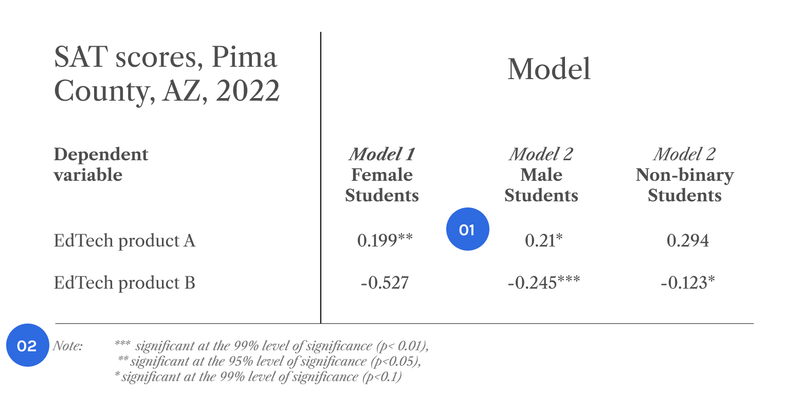
Example – Sample Language to Differentiate Findings

Experiments,
Randomized
Control Trials

“Data indicates that A caused B”

Experiments,
Randomized
Control Trials

“A affected B”

Correlational,
longitudinal,
natural groups

“A predicted B”

Correlational,
longitudinal, 
natural groups

“A was found to be related to B ”

Correlational,
longitudinal, 
natural groups

“The findings show an association between A and B ”

Principle 03

Communicating Statistical Significance Clearly

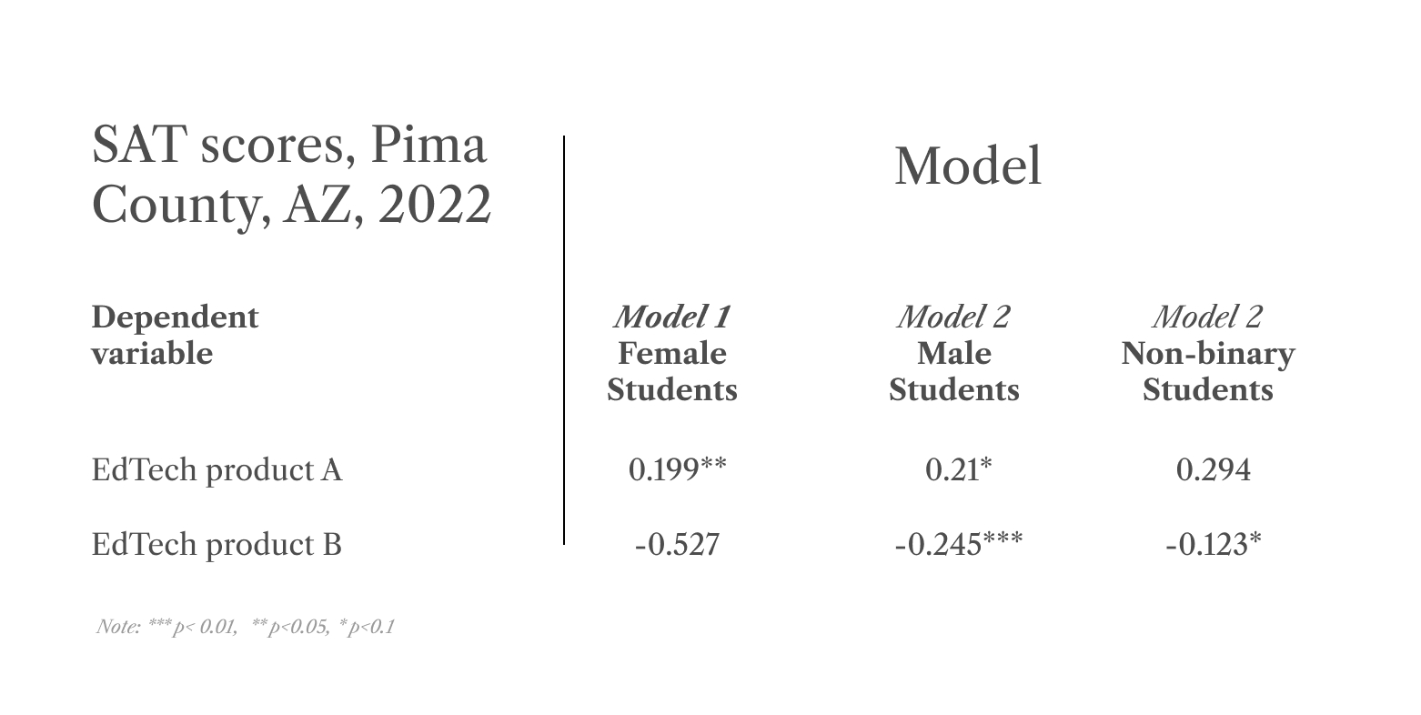
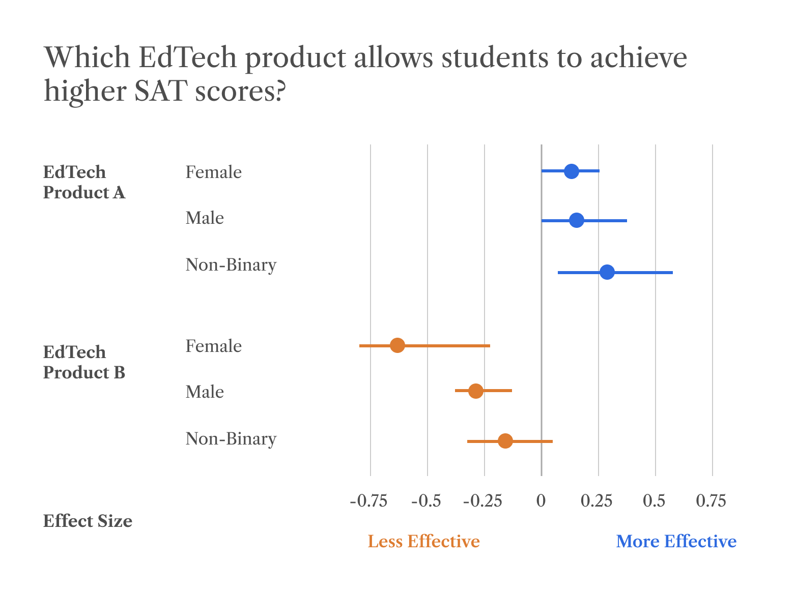
Statistical significance in data determines whether an observed phenomenon is directly caused by a factor of interest or not. Researchers use the term “statistically significant” when they are highly confident that the observed results are not due to chance.

Including information on whether evidence has been found to be statistically significant or not can be a helpful signal for evidence users on whether to rely on those specific findings in their decision-making.

Example

Framing District Demographics in Case Studies

Ineffective

341d2b22
  • 01 Stars differentiate levels
  • 02 Legend explains boundary levels of significance

When reporting results of statistical tests, such as regression analyses, evidence creators can use markers to effectively communicate different levels of significance.


Principle 04

Improving Accessibility of Research

Evidence creators should ensure that the output of research is comprehensible to different audiences which may have varying levels of expertise with statistical concepts.

In order to enhance the accessibility of research, evidence users should adhere to the following principles:

Consider using visualizations or different mediums to bring text to life. Providing visual aids could allow evidence users to grasp complex findings in a much more efficient manner, relative to just text. 3.1 – Leverage Meaningful Data Visualizations provides further guidelines on how to visualize your data.

Avoid using jargon or technical language when describing your methodology and findings. Any statistical method, concept, or terminology that might require specialized knowledge to understand should generally be avoided. As a way to check, use a free readability tool to identify the grade level necessary to comprehend your evidence.

Ensure that the language is inclusive. Is the language used strictly gender neutral? Does it use terminology accurate to the community being described? The resource Communicate to Users Inclusively provides more guidelines on ensuring that the language used is inviting to all communities.

Summary

This toolkit is thoughtfully crafted to empower evidence creators with the tools and knowledge necessary for effectively communicating their research findings. With each section contributing to our overarching goal of facilitating the adoption of evidence-based decisions, you can be confident that your research will have a meaningful impact. 
From highlighting the significance of capturing your audience’s attention with clear and engaging evidence titles, to providing guidelines for conveying statistical significance and implications effectively, this tool equips users to not only create compelling evidence but to also inspire confident and informed decision-making.

Key Takeaways

  • Clear, concise, and memorable titles are key to engaging your audience and improving citation rates.
  • Visual representations of data help identify trends and anomalies. Consider translating raw data into accessible visuals.
  • Make evidence accessible by highlighting key takeaways upfront, explaining methods clearly, and keeping content concise.
  • Reduce bias in decision-making by providing objective information on successful evidence use in similar districts.
  • Frame evidence to address specific district needs for improved uptake.
  • Ensure that your presentation follows best practices to reduce the risk of miscommunication and maintain accuracy.

Download Postcard Summary

Get summary and key insights cards for the core curriculum, ed tech, and professional learning segments.
Download PDF
template

2 Service, Owain, Michael Hallsworth, David Halpern, Felicity Algate, Rory Gallagher, Sam Nguyen, Simon Ruda, and Michael Sanders. “Easy Attractive Timely Social – Behavioural Insights Team.” The Behavioural Insights team. Accessed January 31, 2024.

³ The Decision Lab (2022).

³ The Decision Lab (2022).

4 Letchford, Adrian, Helen Susannah Moat, and Tobias Preis. “The Advantage of Short Paper Titles.” The Royal Society Publishing, August 1, 2015.

5 Guo, Feng, Chao Ma, Qingling Shi, and Qingqing Zong. “Succinct Effect or Informative Effect: The Relationship between Title Length and the Number of Citations.” SpringerLink, June 26, 2018. https://link.springer.com/article/10.1007/s11192-018-2805-8

3 The Decision Lab (2022).

³ The Decision Lab (2022).

6 Soyer, Emre, and Robin M Hogarth. “The Illusion of Predictability: How Regression Statistics Mislead Experts.” International Journal of Forecasting, September 2012.

³ The Decision Lab (2022).

3 The Decision Lab (2022).
7 Framing Effect The Decision Lab.