In this resource, we equip educators, decision-makers, and evidence creators with the keys to unlock an enhanced website experience. Dive into practical insights that dismantle barriers to evidence access, facilitate seamless navigation, and offer personalized content. Explore the pages below to discover each facet of this comprehensive guide.
Enhance your website
Introduction
At a glance
- Put an end to the intrusive personal information requests.
- Embrace tailored access models designed to foster inclusivity across different districts
- Enhance your website’s usability for all users, especially first-time visitors
- Take control of your website’s user experience by implementing content customization and personalization features
Download a Postcard Summary
to Unlock Key Insights
Removing Barriers to Evidence Access
Many districts across the US lack access to the appropriate evidence.1 The primary obstacles encountered by district leaders in accessing this information include demands for personal data, paywalls, and the need to subscribe to freemium services.
Reducing instances of personal information input and offering select districts alternative access models allows more diverse groups of users to access evidence. This resource offers a set of best practices for designing or redesigning your channels to improve accessibility.
Evidence pertaining to the quality of instructional material can be difficult to access. This is particularly true for evidence that exists in academic journals. Our research revealed that the following two dimensions characterize hard-to-access evidence:3
Access Barriers
Request for personal Information
Many academic journals and commercial hubs require EdTech and Core Curriculum purchasers to submit personal information for accessing evidence.2
Example
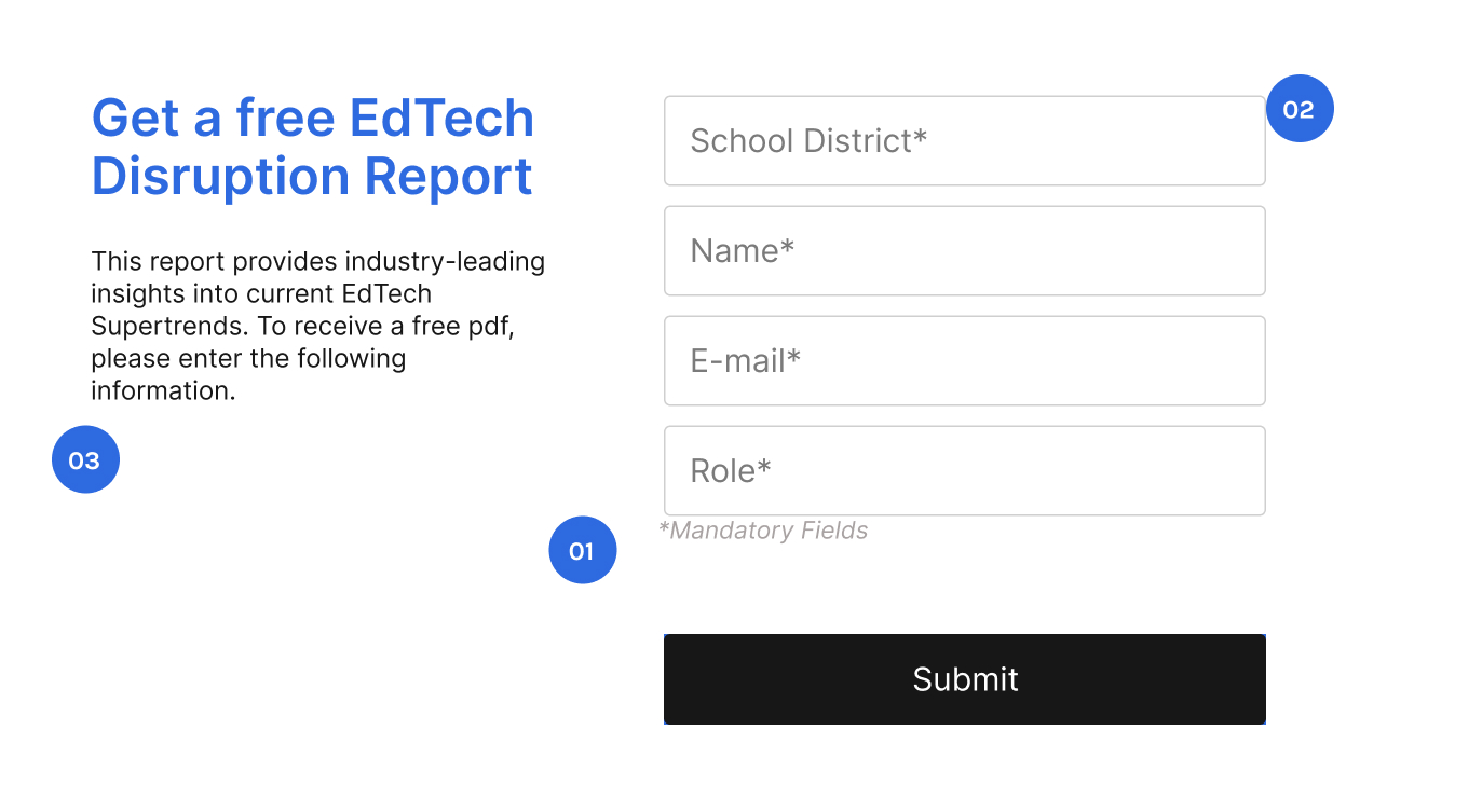
Ineffective Personal Information Request
-
01
All the personal information demanded from the user is mandatory.
-
02
There is no indication on how information will be used
-
03
There is no indication how they would receive the report.
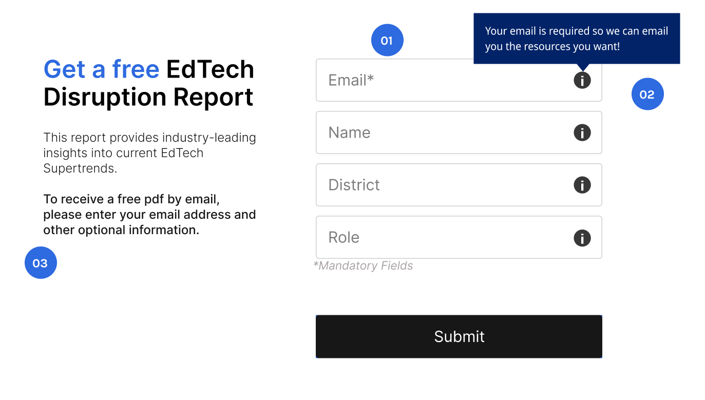
Effective Personal Information Request
-
01
Only email is strictly required, other information is optional.
-
02
Explain the benefit to the user of providing additional information on all fields
-
03
Clearly indicates how the user will receive the material.
Evidence creators should collect only necessary personal information and highlight the added value to the user for providing additional information. In an experiment, when the benefit of information input was made salient, the intention to access the resource increased by 120%.3
Cost of Access
Most sites hosting academic articles require users to possess institutional credentials for a library subscription or to purchase instant access for resources. Most evidence users do not have access to institutional subscriptions.2
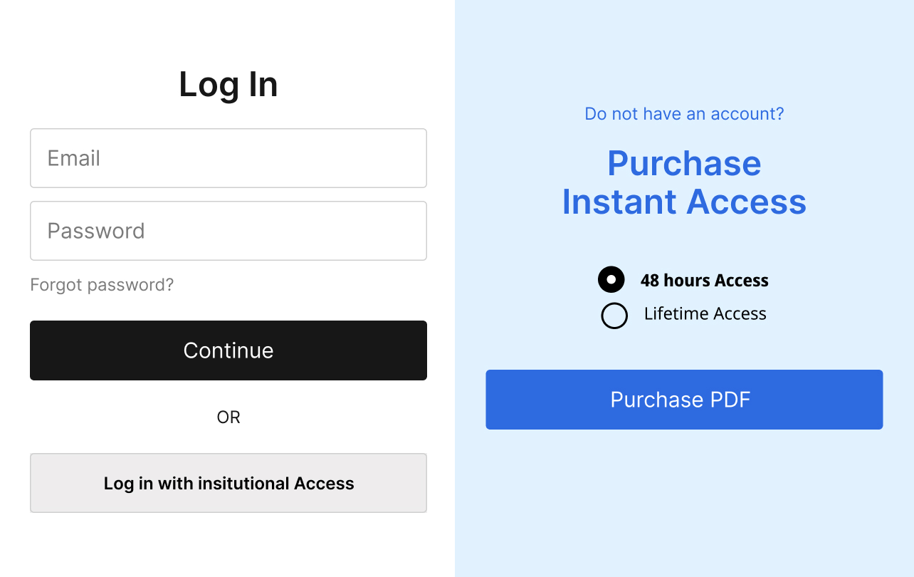
Evidence creators and curators should start by analyzing their need to collect personal information and the need to monetize resource access.
This way, your organization can determine what personal information is strictly required to interact with users and identify the most suitable access model.
Access Models
Example
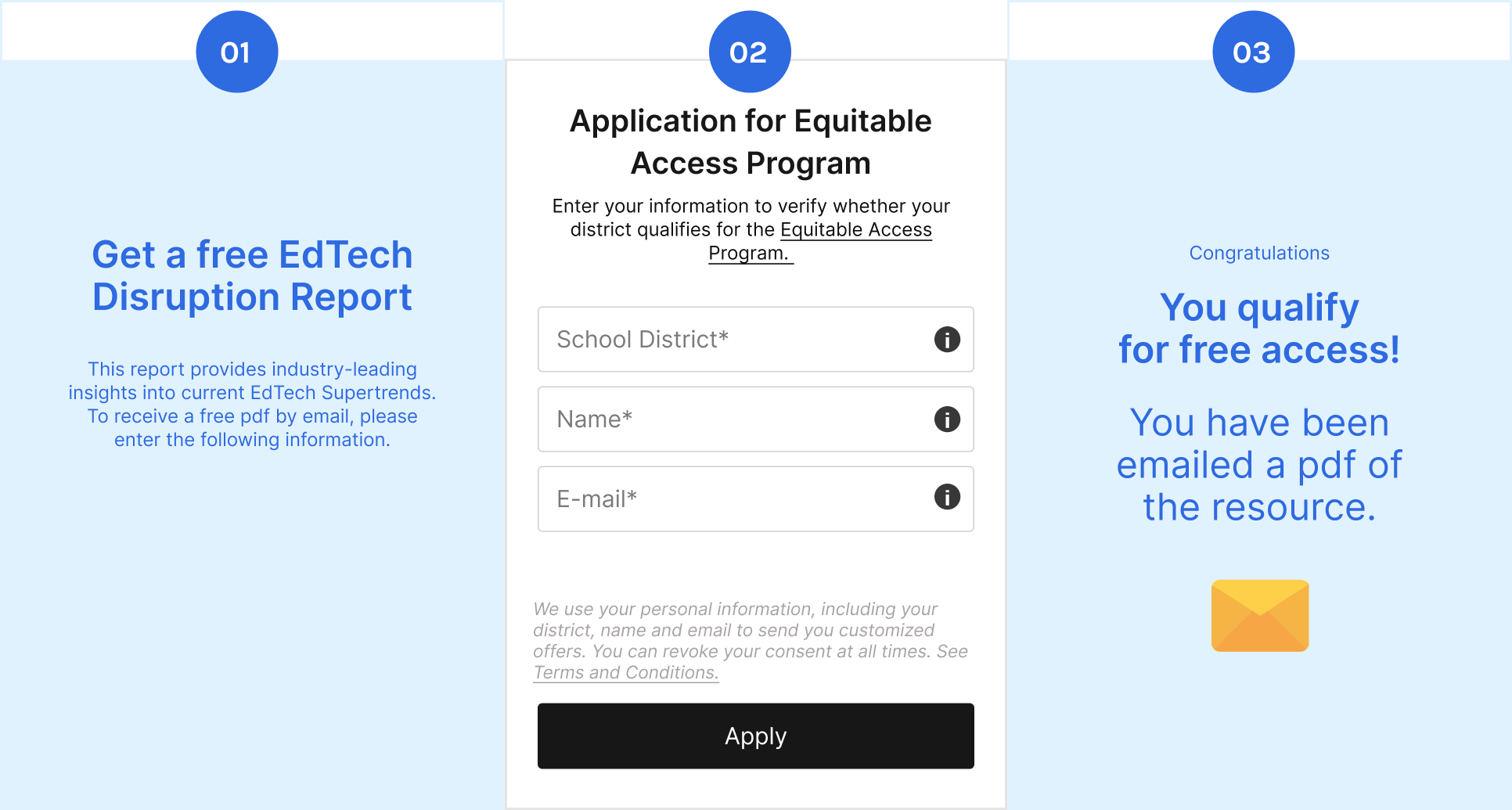
Democratizing Access
-
01
Step 1- A banner informs the user about an alternative access model. Shows next steps and allows user to get more information
-
02
Step 2 – Request key information for low-budget districts and acknowledge how that information will be used.
-
03
Step 3 – Confirm successful data upload and acknowledge the give guidance on accessing the resource.
Evidence creators and curators should consider providing users from low-budget districts who are dedicated to evidence purchasing with free access to academic evidence.
Customization and Personalization
Website customization refers to the integration of features on your site that allow visitors to select what content they want to be shown. Personalization, on the other hand, involves presenting unique content for website visitors based on their context, demographics and needs.
For many individuals, a personalized web experience has grown into an expectation rather than a nice-to-have. This resource offers insights into implementing customization & personalization to help users access the most relevant content in the most frictionless way.1
Operating a website requires technical skills and knowledge of multiple tools that help measure and track website performance. The primary objective in enhancing any website is to enhance the user experience.
A more favorable user experience results in increased engagement rates with the available resources and facilitates the creation of meaningful interactions between your organization and your target audience.
Below are three steps that can help you enhance user’s website experience: diagnosis, personalization, and customization:
Diagnosis of website performance
Understand the effectiveness of your platform towards your intended audience
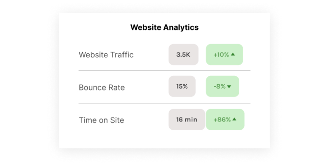
Website performance gives a glimpse on how effective your platform is to your intended audience. Through understanding visitor metrics, you can work on improving the user experience on your site.4
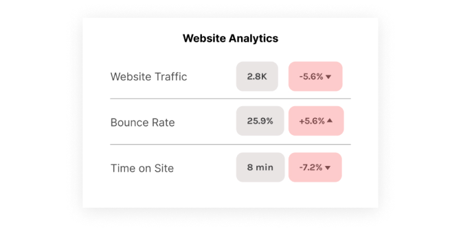
Personalization Indicators are established tools and measurement methodologies that provide early signals as to whether or not users are struggling to find relevant content.
- User Flows
Allow for detailed analysis of how users interact with your platform. They provide insights into whether users are struggling to find relevant material. However, they can be more difficult to interpret and draw conclusions from.5
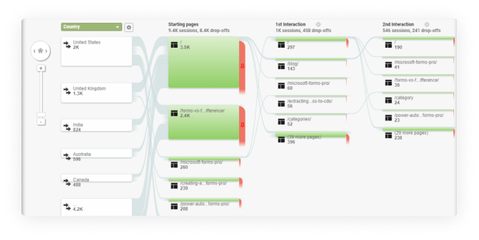
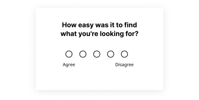
- Customer Engagement Score
Customer Engagement Score (CES) can enhance user flow analysis. Based on a questionnaire, it provides an indicator of whether or not users are struggling to find materials. If so, this provides a signal for personalization and customization.8
Personalization improves UX, which Improves website analytics as a result
Personalization
Personalization involves creating a unique and individualized experience for each user, improving engagement and satisfaction.
Personalization Strategies
Example
Quizzes for Personalization
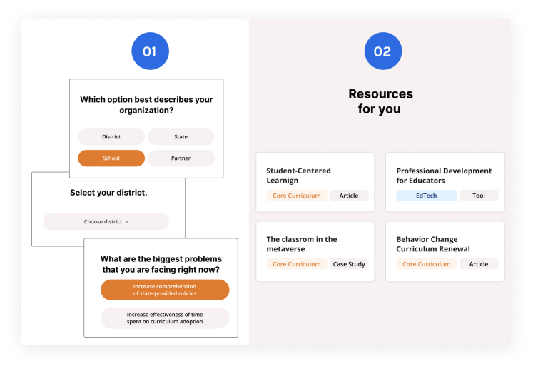
-
01
During the website onboarding, use a quiz to be able to stratify users based on their work background and needs so as to provide them with the most relevant resources.
-
02
Use their quiz responses to generate recommendations.
Without any personalization of content, evidence users may be shown resources that are irrelevant to their backgrounds & needs. Users presented with irrelevant information may leave your site or even discontinue use. Through personalization we can suggest articles, courses, or features that align with their identified interests and expertise. This can greatly enhance user engagement and satisfaction.
Customization
Customization goes beyond personalization, allowing users to actively modify their experience based on their preferences.
Customization Strategies
Example
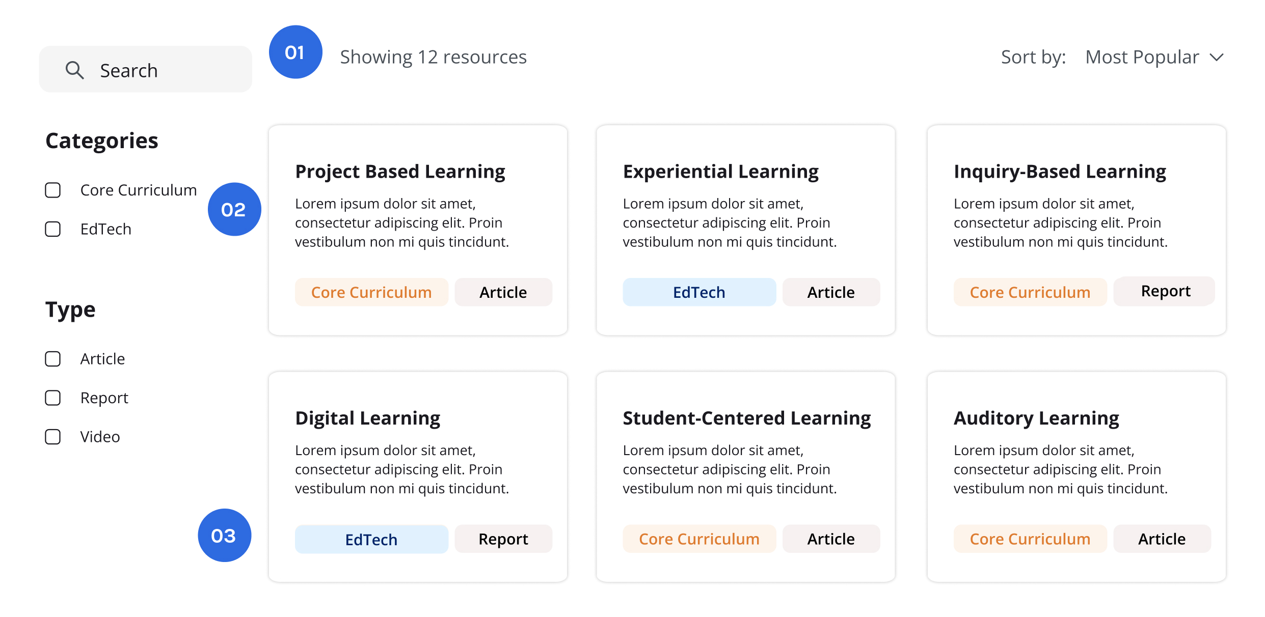
Filters for Customization
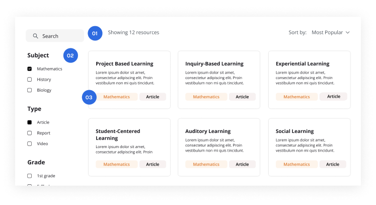
-
01
Search key within the filtered materials
-
02
Filters to remove inapplicable resources
-
03
Category tags within each resource
Without the ability to filter unnecessary information, users may spend a long time trying to find what they are looking for and may feel overwhelmed by the multitude of resources available. Users presented with an array of unfiltered resources may quickly lose interest. By providing filters, users will be able to reduce time spent searching and increase time spent engaging with resources.
Tool Quiz
Please indicate whether each statement is True or False based on your knowledge of effective web diagnostics and analysis practices.
-
Reducing instances of personal information input and offering select districts alternative access models allows for more diversity in users accessing evidence.
a. Falseb. True -
The purpose of diagnosing your website’s performance is to be able to provide relevant information and resources to specific users depending on the selections users make on your site.
a. Falseb. True -
Understanding visitor metrics allows you to work on enhancing the user experience on your site.
a. Falseb. True -
Users presented with an array of unfiltered resources may gain more interest in the contents of your site than users presented with filters.
a. Falseb. True
Tool Quiz – Answers
Please indicate whether each statement is True or False based on your knowledge of effective web diagnostics and analysis practices.
-
Reducing instances of personal information input and offering select districts alternative access models allows for more diversity in users accessing evidence.
a. Falseb. True ✔ -
The purpose of diagnosing your website’s performance is to be able to provide relevant information and resources to specific users depending on the selections users make on your site.
a. False ✔b. True -
Understanding visitor metrics allows you to work on enhancing the user experience on your site.
a. Falseb. True ✔ -
Users presented with an array of unfiltered resources may gain more interest in the contents of your site than users presented with filters.
a. False ✔b. True
Summary
This comprehensive three-part resource equips evidence creators and curators with the tools to enhance website accessibility, user-friendliness, and personalization. Implementing these insights ensures educators and decision-makers can effortlessly access valuable resources and enjoy meaningful interactions on websites.
Removing Barriers sheds light on dismantling barriers to evidence access, emphasizing the importance of diverse access models.
Navigate with Confidence focuses on user-friendly navigation and intuitive features, highlighting the significance of proactive nudges and clear calls-to-action.
In Customization & Personalization, the spotlight is on website customization and personalization, emphasizing a frictionless user experience.
Key Takeaways
- Offer diverse access models, including free, freemium, and paid subscriptions.
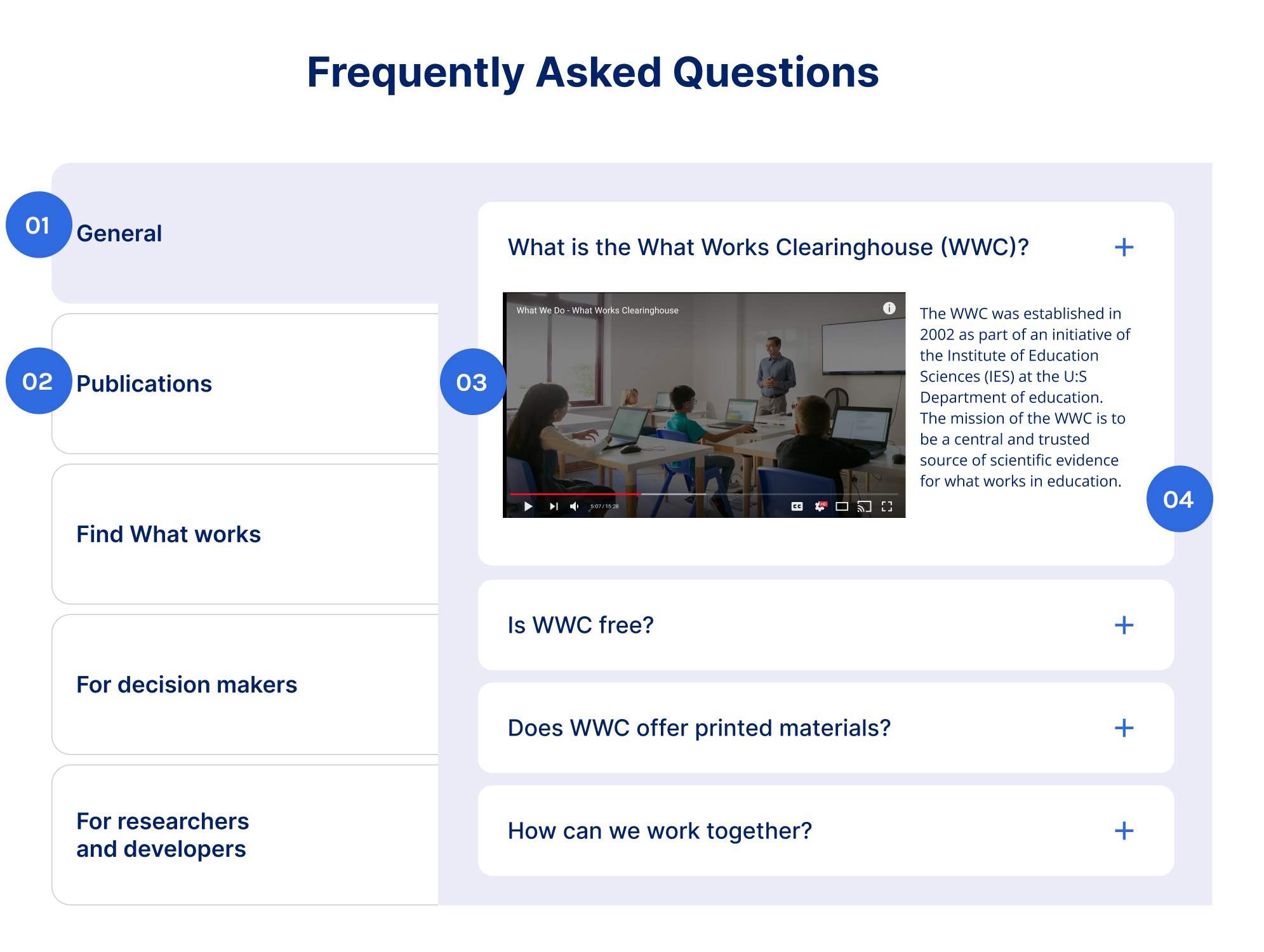
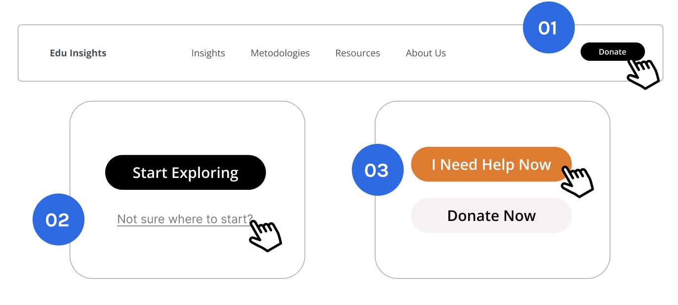
- Proactively nudge users with clear calls-to-action and FAQs.
- Enhance user-friendliness with simple navigation tools and guidance
- Implement website customization to allow users to choose preferred content.?
- Embrace personalization to provide unique, context-specific content for a frictionless user experience.
Download Postcard Summary
- 1 The Decision Lab, Survey (2022).
- 2 The Decision Lab (2022).
- 3 The Decision Lab, Choice Experiment (June 2022).
- 1 The Decision Lab, Survey (2022).
- 4 Juviler, Jamie. “The Ultimate Guide to Website Performance.” HubSpot Blog, January 12, 2021.
- 5 Kaplan, Kate. “User Journeys vs. User Flows.” Nielsen Norman Group, April 16, 2023.
- 6 Timar, Adina. “Customer Engagement Score: Measure CES to Improve Engagement.” Userpilot, June 26, 2023.


